Teaching You to Trade Stocks 64: Supplementary Lesson on the Way to the Airport
2007/7/2 21:37:44
The lessons have been getting more and more detailed recently, especially using the smallest 1-minute level. With most theories, on such a fine-grained chart with so much randomness, everything would fall apart. But this is precisely where the power of this ID's theory is demonstrated. Never mind 1-minute charts—tick-by-tick charts would be no problem either. This is the power of the geometric structure that this ID's theory constructs. The world is all geometry—let alone those few boring price charts.
Look at the chart below. Why is the afternoon's segmentation like this? Probably very few people can figure it all out right now. So, to let everyone sleep soundly tonight, and also just in case the plane decides to misbehave later—at which point you'd all be left here arguing endlessly with no one to provide answers—this ID is using a laptop on the way to the airport to give you all a supplementary lesson.
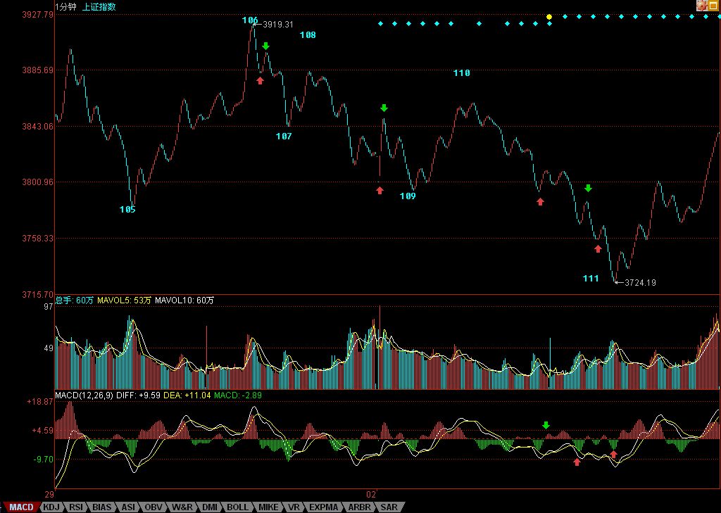
The stroke indicated by the arrow in the segment from 106 to 107 uses the rounding premise. So, if you analyze it carefully, you'll know it's definitely a stroke. On this issue, this ID noticed that a netizen called Happy vs. Cabbage Worm already mentioned it. Of course, you might ask: why must we round? There's no necessity to it—it's just a preset premise. You could adopt precision to two decimal places. But in fact, for something as fine as a 1-minute chart, different software will have slight numerical differences. So, so-called precision often isn't necessarily precise. And in such a rapidly changing market, minor numerical differences really don't matter much. For example, another approach could be: treat anything within a 0.5-point difference as the same. For all preset precisions, the only rule that must be followed is: once the precision is preset, it must be maintained consistently throughout.
Note: no precision is perfect. For instance, if you treat differences within 0.5 as identical, what about 0.51? It's not much different from 0.49. So these details really don't matter much. The key is consistency—don't keep changing back and forth. Since this is just a demonstration for learning purposes, we'll continue using rounding precision throughout. You can adjust according to your own situation.
As for 108-109, why isn't the stroke with the arrow counted as a line segment? In other words, why isn't 108-109 three segments? This is simple: a line segment must consist of at least three strokes. If a gap is contained within a stroke—like today's morning low-open gap, which didn't break the previous day's stroke and just continued downward along that same stroke—then such a gap is no different from normal price movement, and the gap is still contained within the previous day's stroke. But some sudden gaps that go against the trend—like the 530 one—must be treated as a line segment, not merely as a stroke or part of a stroke. Someone might say: a gap doesn't have three strokes? You can look at it this way: just as 0=0+0+0, a gap can be viewed as the superposition of three gaps, giving you three or more strokes. Also, a netizen called "Watching from the Sidelines" has a pretty good understanding: a line segment must be destroyed to be considered finished. But it must be emphasized that a line segment must be destroyed by another line segment for it to be truly destroyed. A single stroke alone cannot destroy a line segment—this avoids interference from particularly random factors on the trend.
As for 110-111. Why aren't the two positions marked with red arrows the final precisely positioned divergence points? These are simple questions that should have been resolved long ago. Take the first red arrow position: the first time prices slightly broke below the 109 level, if you compare the area that has already appeared with the corresponding area sum of 108-109 in front, it's already very close. That means the 110-111 segment, just at the beginning of its decline, already has momentum nearly equal to the previous 108-109. This precisely indicates that this segment's momentum is very strong. Not only can it not possibly be a divergence relative to 108-109, but from the perspective of hub oscillation, this kind of momentum can only be resolved either by small levels converting to larger levels (trading time for space) or by divergence produced through comparison with an even larger-magnitude segment. This latter scenario, in this actual chart, is the comparison with the decline of 104-105. The segment 110-111 is being compared with the segment 104-105, with the hub of the intervening oscillation being the area from 105 to 110. Therefore, there's absolutely no question of comparing with 108-109 here. From the perspective of the 105-107 hub, although 110 doesn't constitute a third-type sell point, it's extremely close. This kind of departure from a hub typically has very strong momentum, so even if you can't figure out which segment to compare with, you should at least wait for this segment's structure to be destroyed before there's any possibility of entering. And subsequently, the two pullback attempts (up-down-up) didn't destroy its structure at all, so the subsequent breakdown decline was perfectly natural and logical.
Arrived at the airport. Saving this first.
Quite fun actually—the post is written in two parts, with a security check in between. Continuing.
As for the second red arrow, it's even less likely to be the divergence point. The pullback at the green arrow is equivalent to a quasi-third-type sell point relative to the micro quasi-hub (note: strictly speaking, there are no hubs below the line segment level, hence "quasi-hub") formed by the up-down-up movement before the breakdown. What follows has two possible developments: either expansion into a larger-level quasi-hub, or quasi-hub movement until a new quasi-hub is formed. The yellow-white lines below show a typical down-up-down structure where the second downward move has just broken below the low of the upward move—this is the most powerful downward thrust. How could divergence possibly appear here? The first red arrow on the MACD points to this powerful downward thrust in the larger down-up-down structure. At this point, unless there's a sudden structural destruction at the line segment level, divergence simply cannot appear. The subsequent pullback actually forms a running-type up-down-up structure (meaning the second upward move just barely overlaps with the low of the first upward move), which effectively constitutes another micro quasi-hub. Together with the one at the first red arrow, this forms a declining trend between two quasi-hubs. Then, the divergence judgment that follows is very simple—same as the standard divergence judgment within a trend. Looking at the two segments before and after the second running-type micro quasi-hub, comparing the MACD green bars corresponding to the two red arrows is obvious at a glance. (Please don't ask why we don't look at the yellow-white lines at this point—this type of question has been answered N times already.)
Please digest all these various scenarios thoroughly. Especially the most fundamental knowledge—you must master it completely. Lessons 62 and 63 must be fully absorbed, and you must be able to apply them in real time. Of course, this requires continuous practice and studying different chart patterns.
This ID has nothing more to say. Preparing to board. By the time I get back to Beijing, it'll almost be the next day.
Signing off first. See you tomorrow.